Superpedestrian
Brand Identity
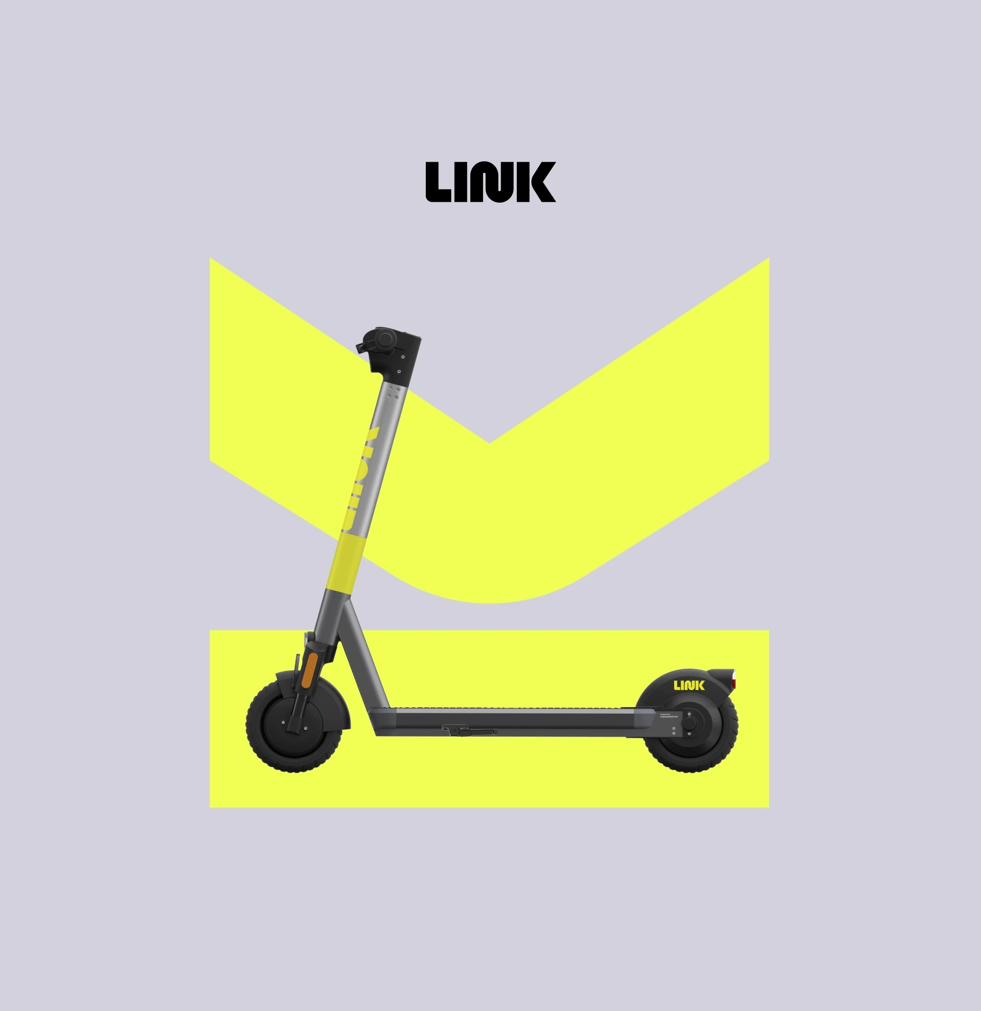
Designing for safety in the crowded world of micro-mobility
Link is the smart, fun, safe way to navigate your city from Superpedestrian. Over a 2-month contract, I developed a brand identity positioning them as leaders in innovation and safety, delivered brand guidelines and gestural applications, and extended into key UI moments of their app.
Role
Lead Designer
Team
Superpedestrian Design Lead
Duration
2 month contract 2019
Positioning & alignment
At the start of the contract, I gave the Superpedestrian team homework to fill out a brand exercise to create alignment on the what, how, and why of their new brand: Link.

Design directions
With an alignment on positioning, audience, and values, I began research, sketching, and designing explorations. I wanted to create an identity that secured Link among the transportation of the future: safe, clean, and reliable, with an innovative and rebelious spirit to stand out in a saturated market.

01 Mobility
My first direction was inspired by my morning commute to work, and the (frankly too few) bike lanes around NYC.

02 Grids
The second direction was inspired by the modern, dense grid structure of big cities around the world.

03 Lines
The third direction takes design inspiration from the dynamic, flowing geometry of Massimo Vignelli’s original MTA subway maps.

04 Ecopragmatism
The final direction presented was a bit of a departure — but a fun one — inspired by the environmental counter-culture of Stewart Brand’s Whole Earth Catalog.

Directions recap
With four distinct directions presented, it was time to pick a lane and begin fleshing out the rest of the brand identity.

Refinement & adding color
The team resonated with the retro-futurism of Direction 03 — Lines. It ticked their boxes from the alignment and positioning exercises: rebelous, innovative, and modern.
The next step was to visually refine the wordmark, select complementary typefaces, and develop an approach to color that would keep Link visually distinct in a saturated market.

Typography selections
For the body text, we wanted a neutral sans-serif that could be implemented at low-cost. For the Display type, we wanted something geometric that could play off of and compliment the wordmark.

Color
Now that Link had an ownable wordmark, they needed an ownable color. I challenged the team that claimed to be building the “safest scooter” to go one step further: own safety.
With a color-saturated market of competitors, I also pushed the team to think along a new axis of reflectivity that could play into their brand identity of providing the safest ride possible.

Brand identity guidelines
The final deliverable was a brand identity guideline outlining the brand positioning, core visual language, and gestural applications.


Coming to a sidewalk near you
Link is now available across the United States and growing their network of e-scooters globally. They have recently released an even bolder version 2 of their scooter and extended the visual system into parent company Superpedestrian’s online presence as well.
Pictures and renders below owned by Superpedestrian and shown for branding application only.


Featured work