Stash
Product Design & Strategy
Humanizing the referral experience
Role
Lead Product Designer
Team
Motion Designer Product Manager Design Director User Research
Duration
6 month contract 2021 – 2022
Overview
Goal
Our hypothesis was that by improving Stash’s referral experience, invites and sign-ups will increase. We knew from research that 85% of successful referrals are in-person or through personal messages from a trusted friend, and that onboarding and transfer funds conversion rates double when a new user is referred vs. when they are not.
Experience audit
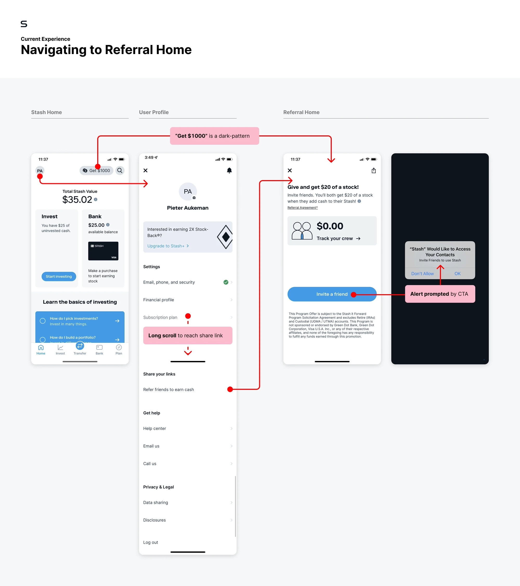
Hard to find, harder to understand
The “Get $1000” referral CTA is misleading, Referral Home is buried at the bottom of User Profile, and instructions are unclear. Additionally, the language seems to encourage monetizing your relationships with friends to make $20.
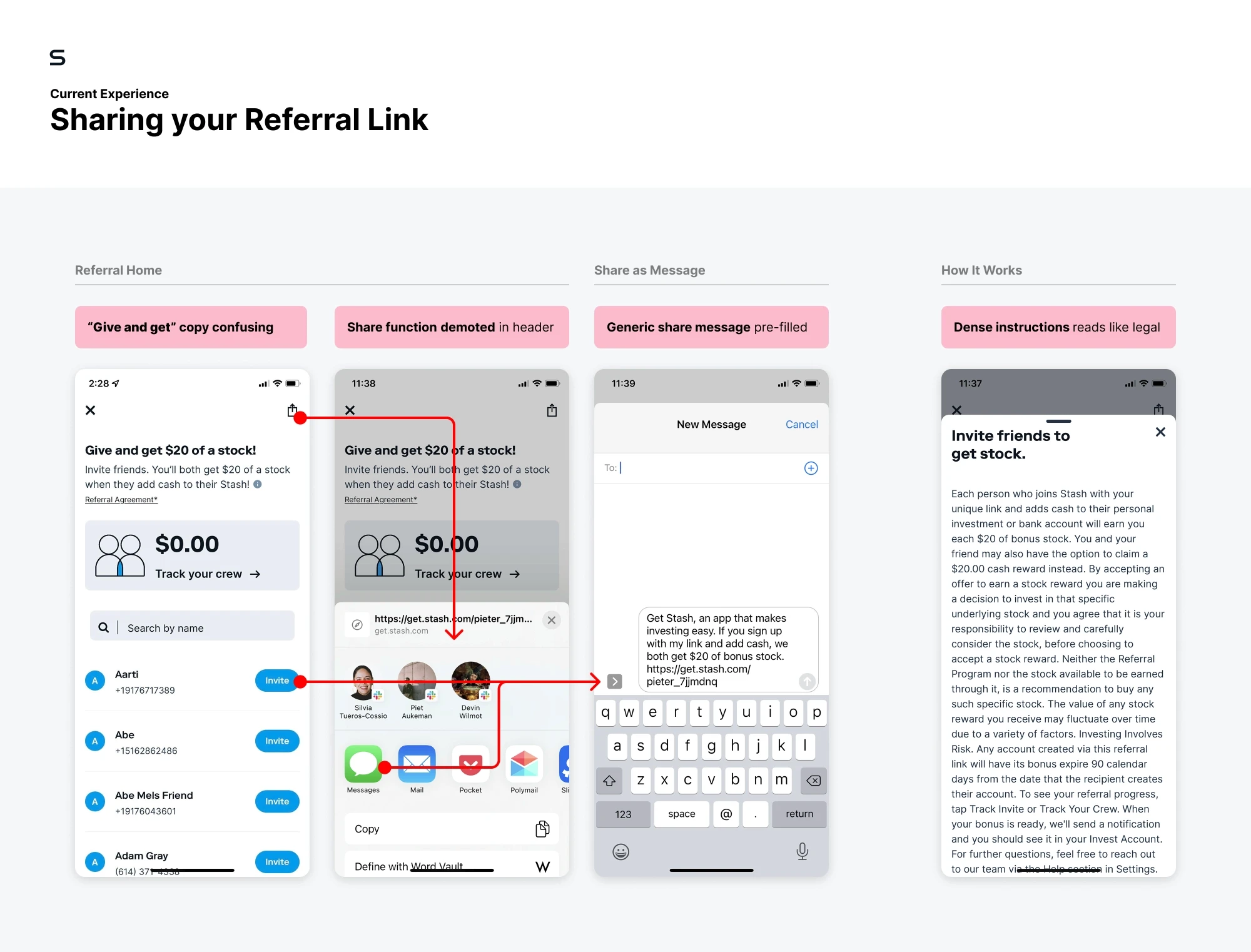
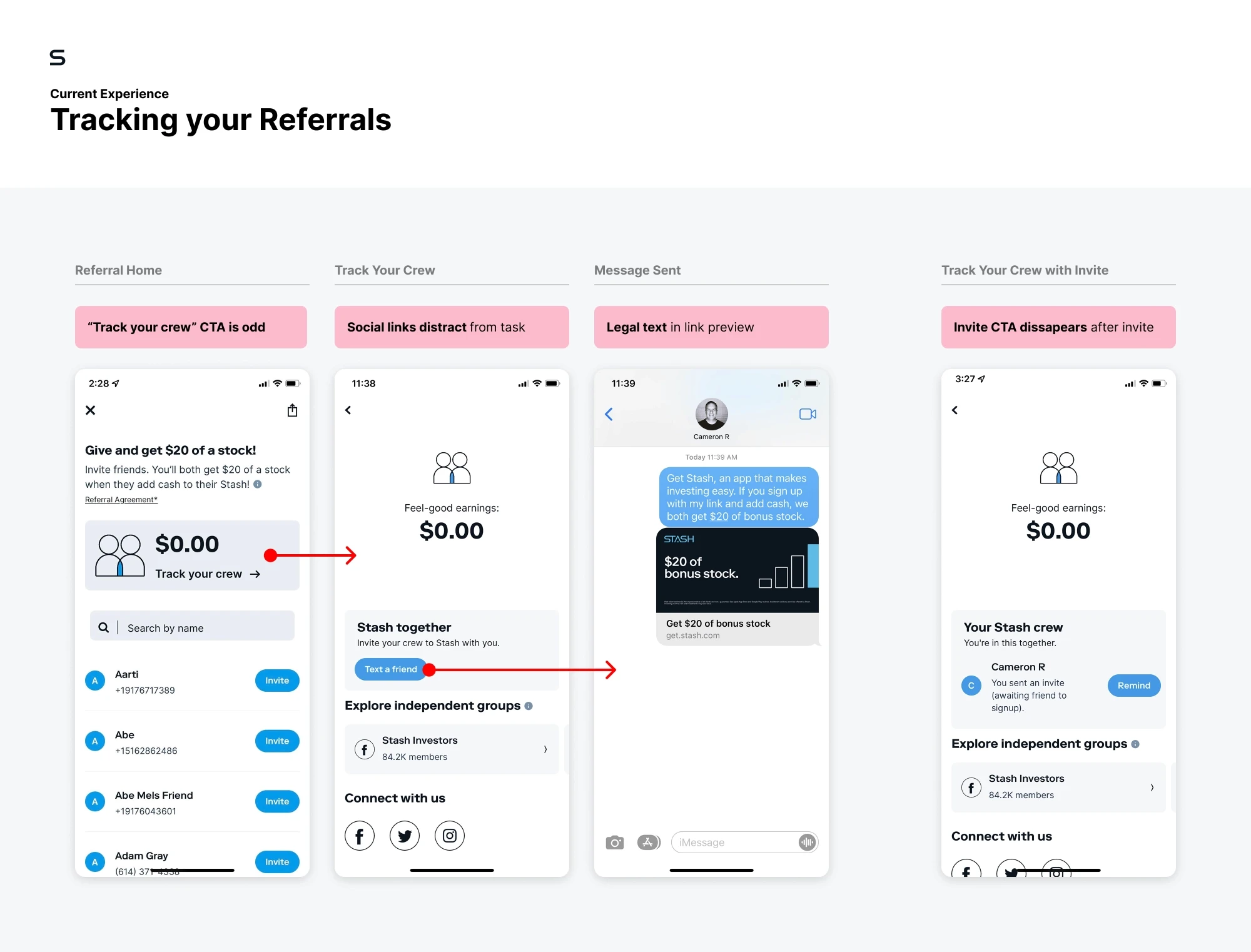
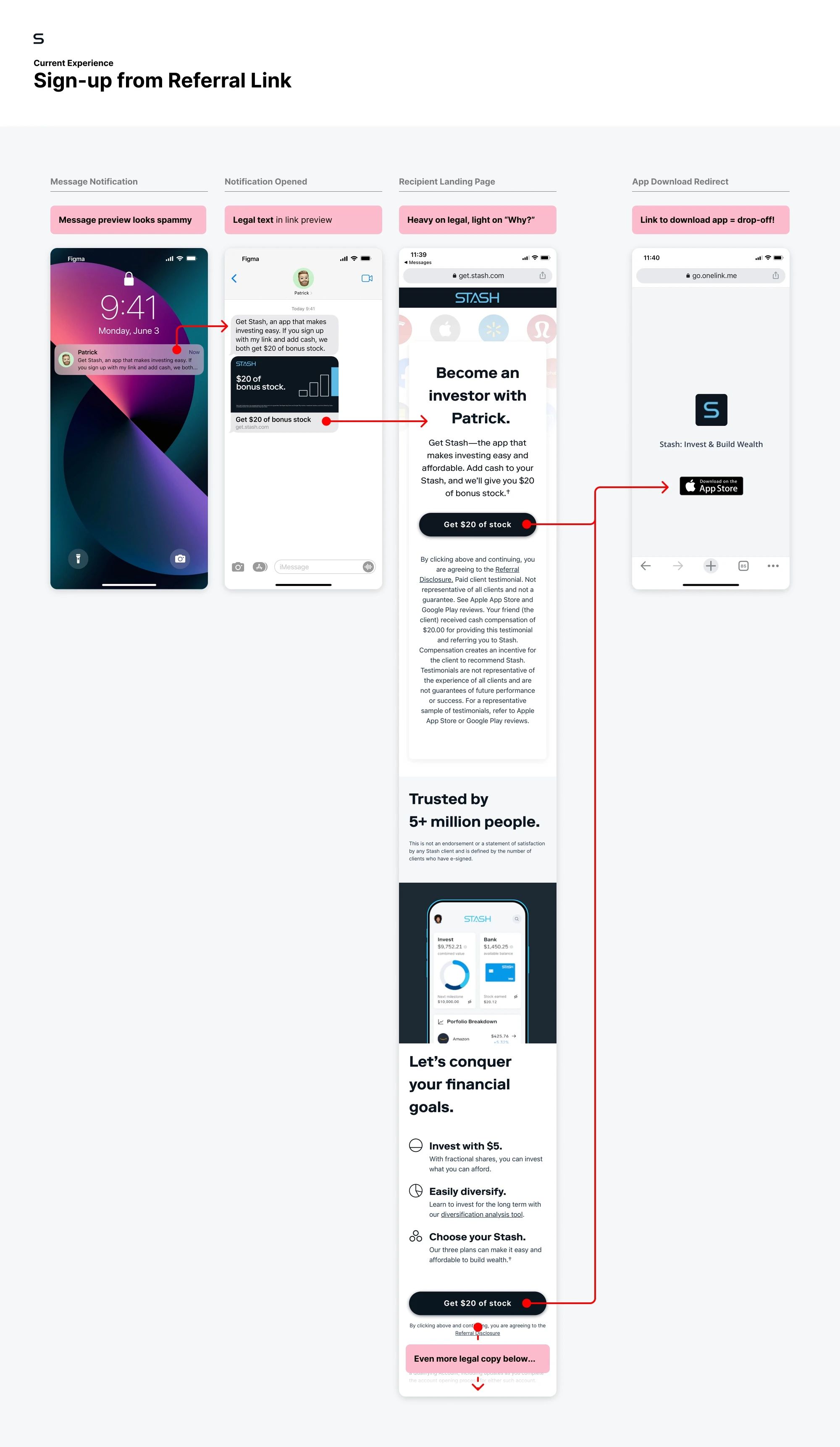
Referral recipients are met with a pre-filled text message that appears spammy at first glance. Following the link does a poor job of explaining what Stash is and how it’s different. The experience ends with an app download redirect page with potential for significant drop-off. App onboarding then presents them with a plan selection screen with no mention of their referral.
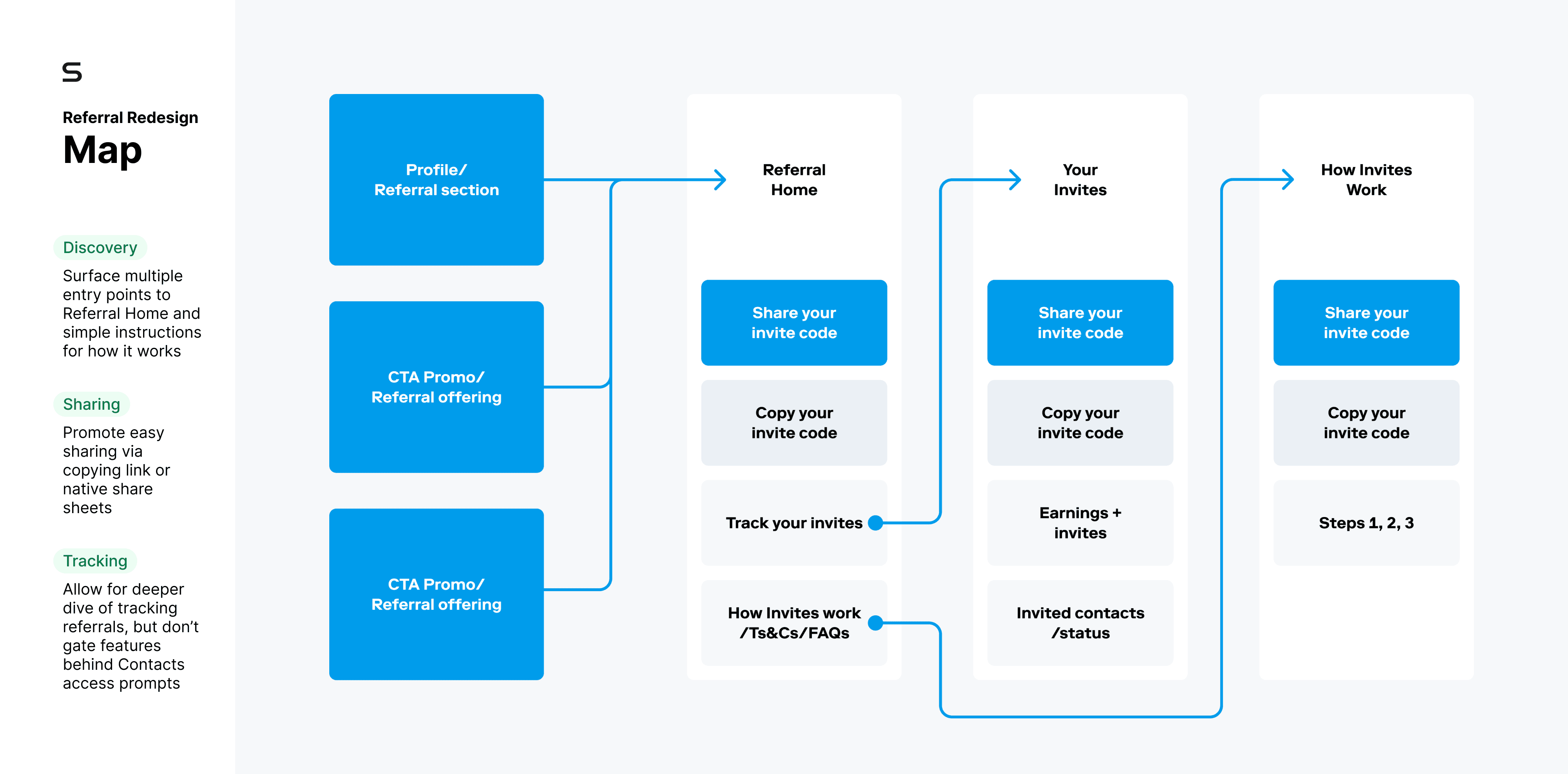
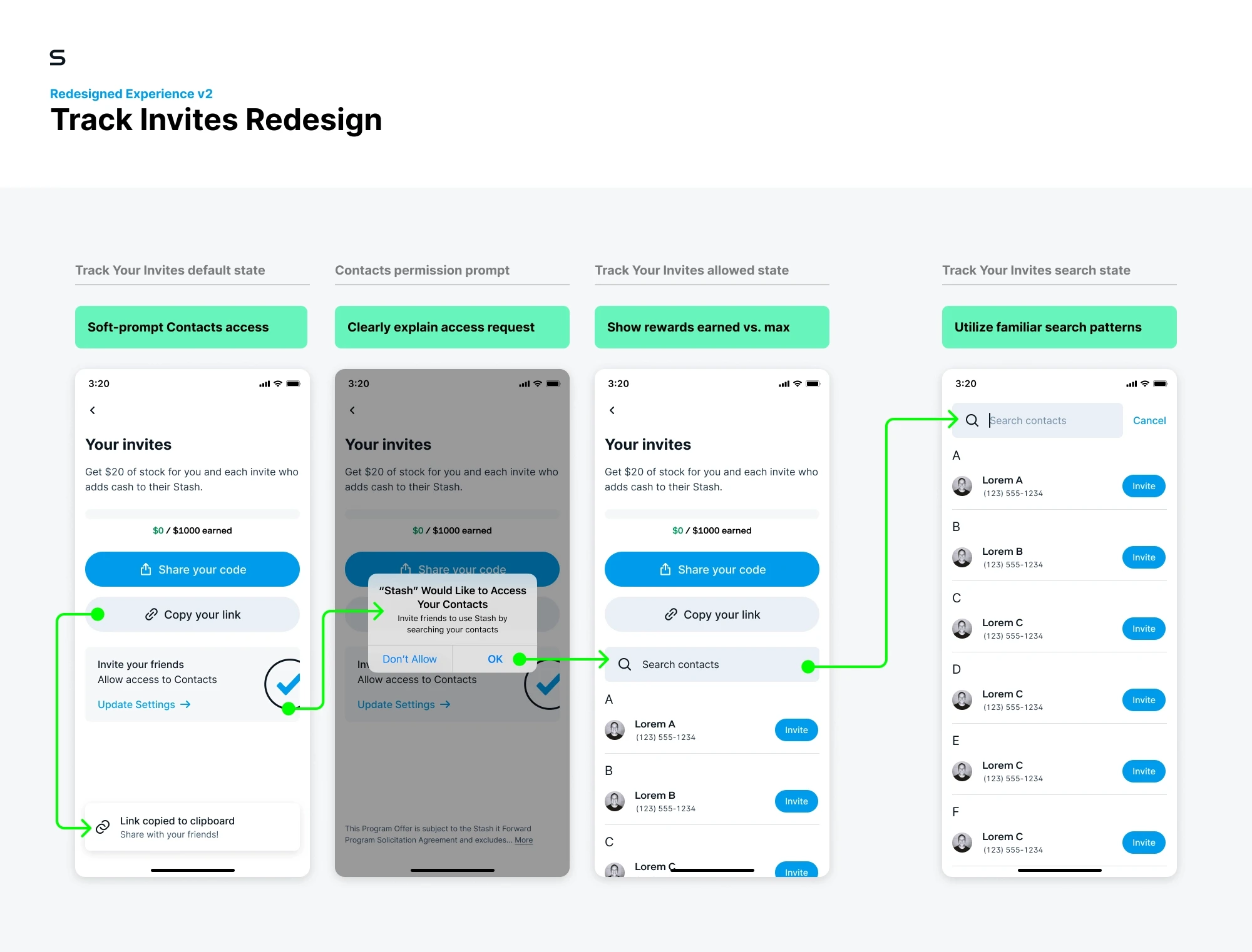
Improve sharing experience, instructions & navigation
With best practices in mind, I aimed to make the referral program easier to find, understand, and navigate for referrers. A small win with big impact was simply adding the ability to copy your link to clipboard and share via your preferred method (social, text, email, etc.).
We took the below prototype into testing to get signals around why users are likely to recommend a product or service, and whether they themselves have referred Stash to friends.
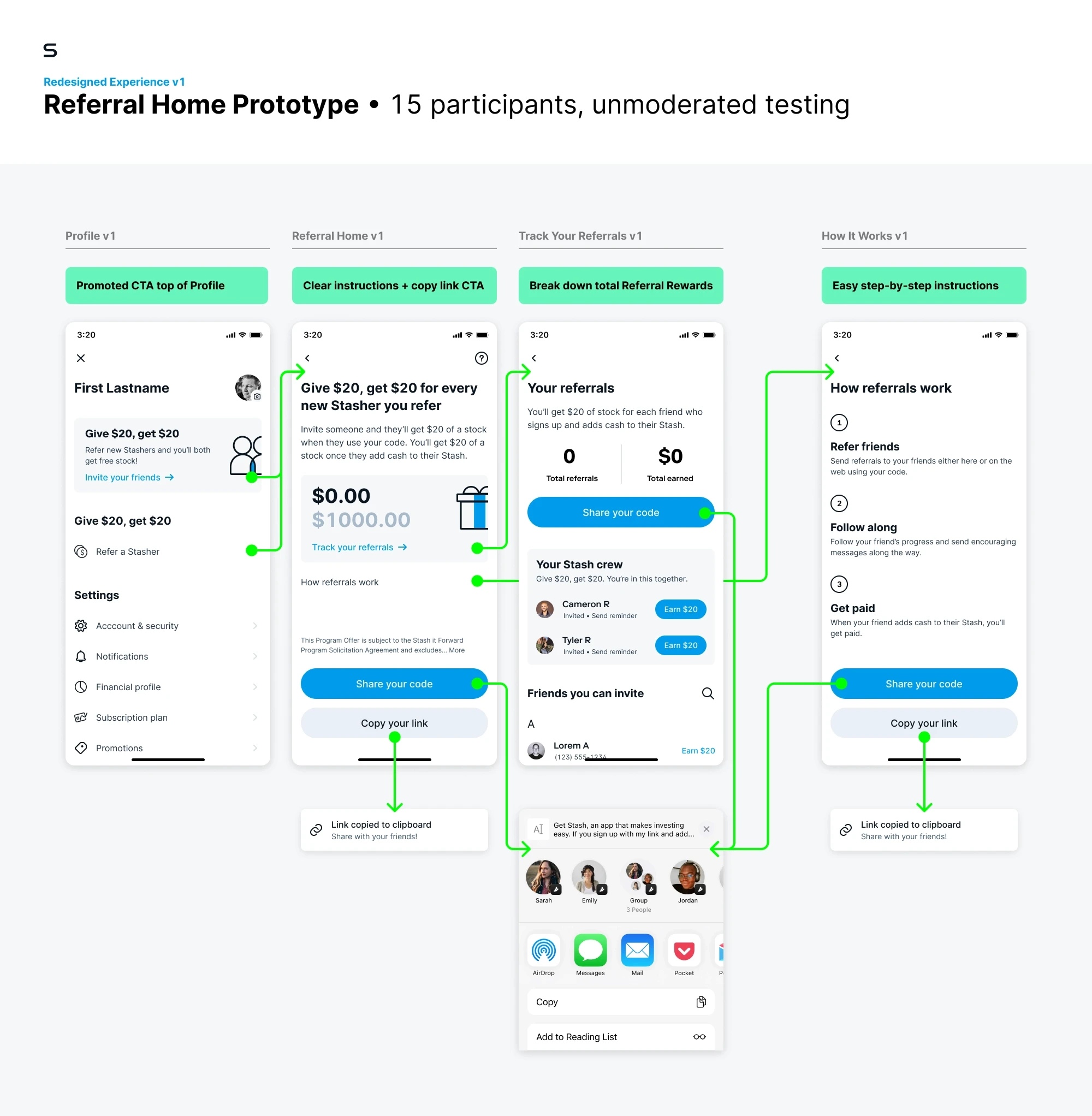
Findings from testing with 15 participants
Simple & Straightforward
Testers overall found this lightly redesigned flow easy to use and behaved exactly as they expected a referral flow to.Free Money
Everyone loves free money. For most testers, the incentive here was memorable and motivating. However, most haven’t referred anyone yet.“Give $20, Get $20”
At least 2 testers were initially confused by this language, thinking it would net out to a $0 reward.Halo Effect
Good, polished products have an overall “halo effect” that make users want to recommend it to others. When the experience is seamless it “seems like something everyone should use!”
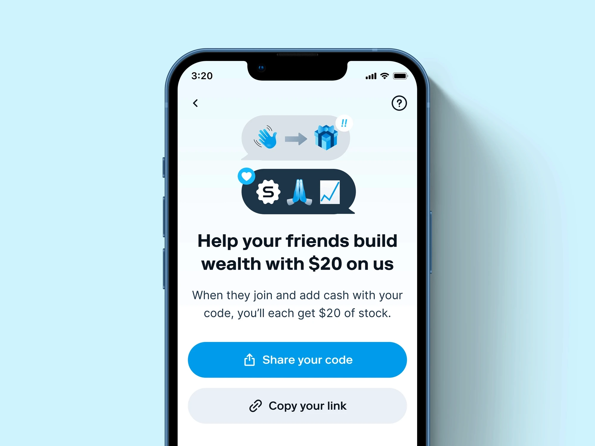
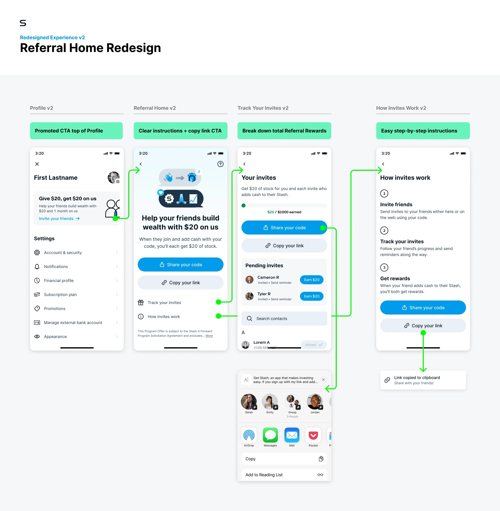
Referral home redesign
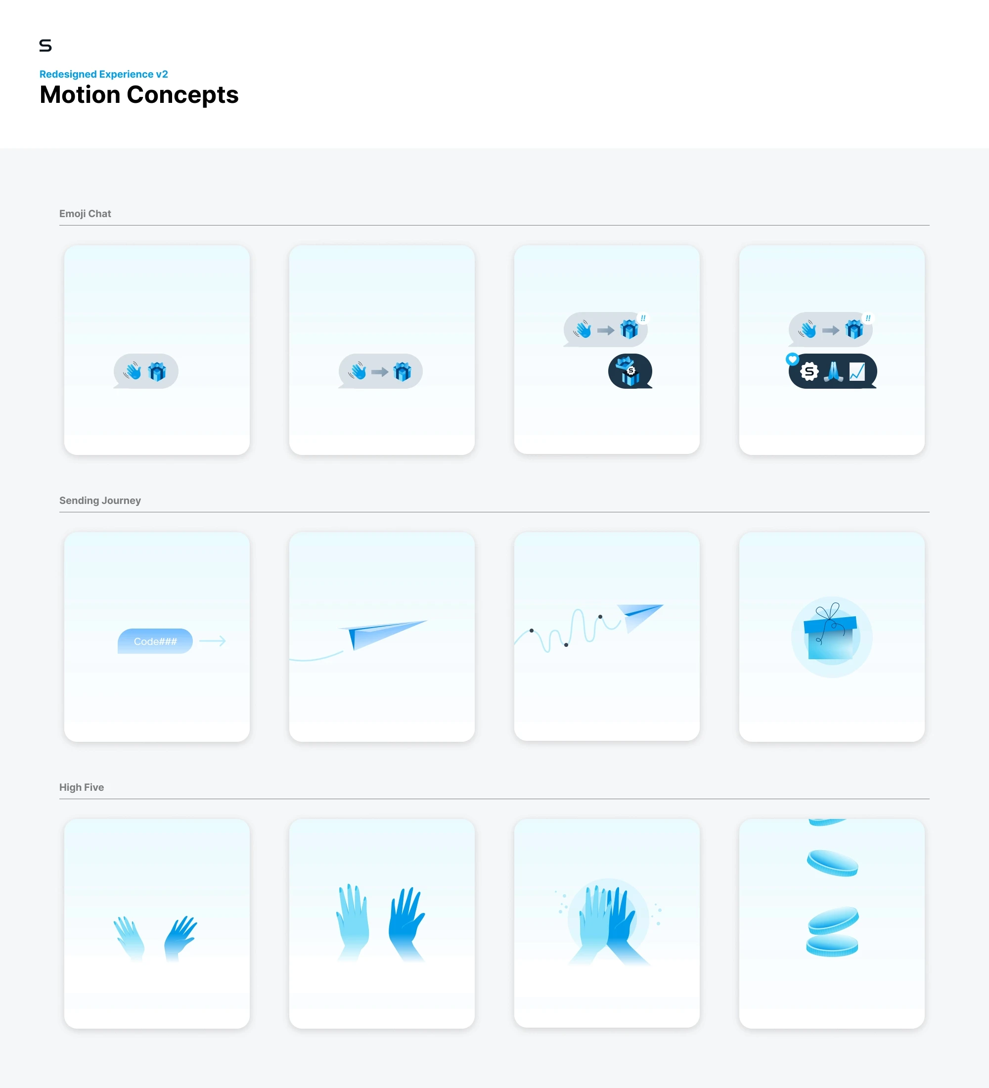
Adding a touch of delight & sense of altruism to the “invite”
With the above findings from our optimized Referral Home architecture, I worked with a motion designer to explore ways of adding delight into the referral process. We wanted to visually communicate the “referral journey,” the back-and-forth conversation that happens when a product like Stash is referred to a friend.
We also dug into the psychology of referral programs with a paper titled The Role of Metaperception on the Effectiveness of Referral Reward Programs. The authors show that “recommendation behavior is driven by the givers perception (i.e., their metaperception) of how they will be viewed by the receivers” — notably, if the referral comes across as self-serving, they are less likely to share it.
With our redesign we wanted to shift the Stasher’s perception from referring to “help yourself” to that of inviting to “help friends.” This is subtly reinforced in the revised copy, referring to it as “invite” rather than “refer” a friend. We wanted to discourage monetizing your relationships and reinforce helping a friend.
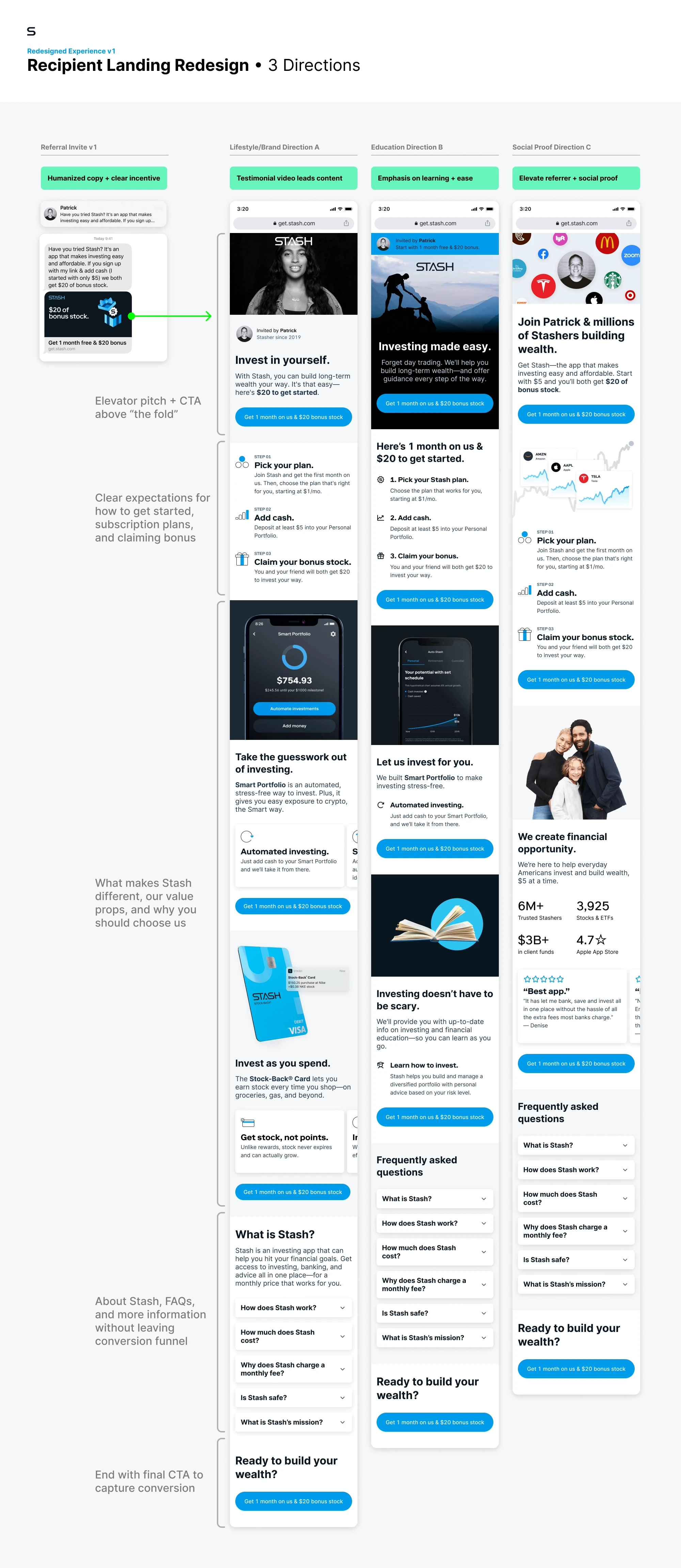
Recipient landing experience
Communicating Stash’s value more clearly & setting expectations for new users
Following the redesign of Referral Home, it was time to turn to the Recipient experience when they follow their friend’s referral link. The current landing page wasn’t selling new users on what makes Stash unique, setting proper expectations that it’s a subscription product, or how to redeem the referral bonus of $20.
We ran moderated testing on the current Recipient Landing experience with the goal of better understanding how users make decisions to subscribe to a service and how best to demonstrate the value of Stash to new users. With these findings, we were able to improve the experience to increase account creation conversion for referred customers.
Prototyping new directions
With the new landing design, we sought to make the pre-filled message less generic and reinforce the referrer with a more personalized landing page. The directions have different takes on what makes Stash unique and either lead with video testimonial, an educational value prop, or elevating the referrer with social proof.
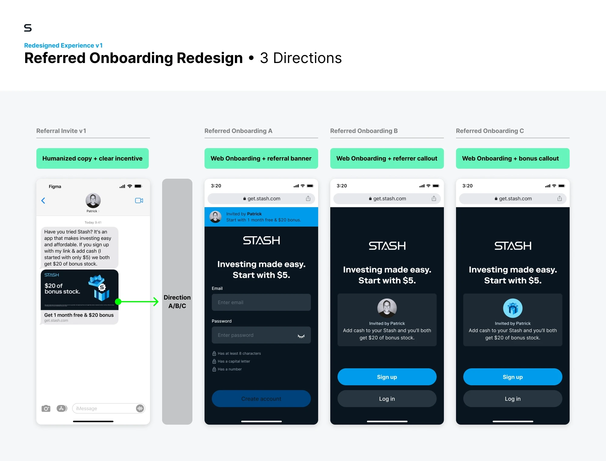
After conversion, we direct new users directly to web registration rather than app download to reduce drop-off. The new onboarding reinforces their friend and referral bonus to create a more seamless referral experience.
Continued testing and implementation
My contract with Stash ended as the team prepared to A/B test the Referral Home Redesign in-app and bring the Recipient Landing Redesign directions into user testing.
Featured work