The future of work is now On Demand
View Website↗
Product Design & Strategy
Lead Product Designer (Full-time)
2018–2021
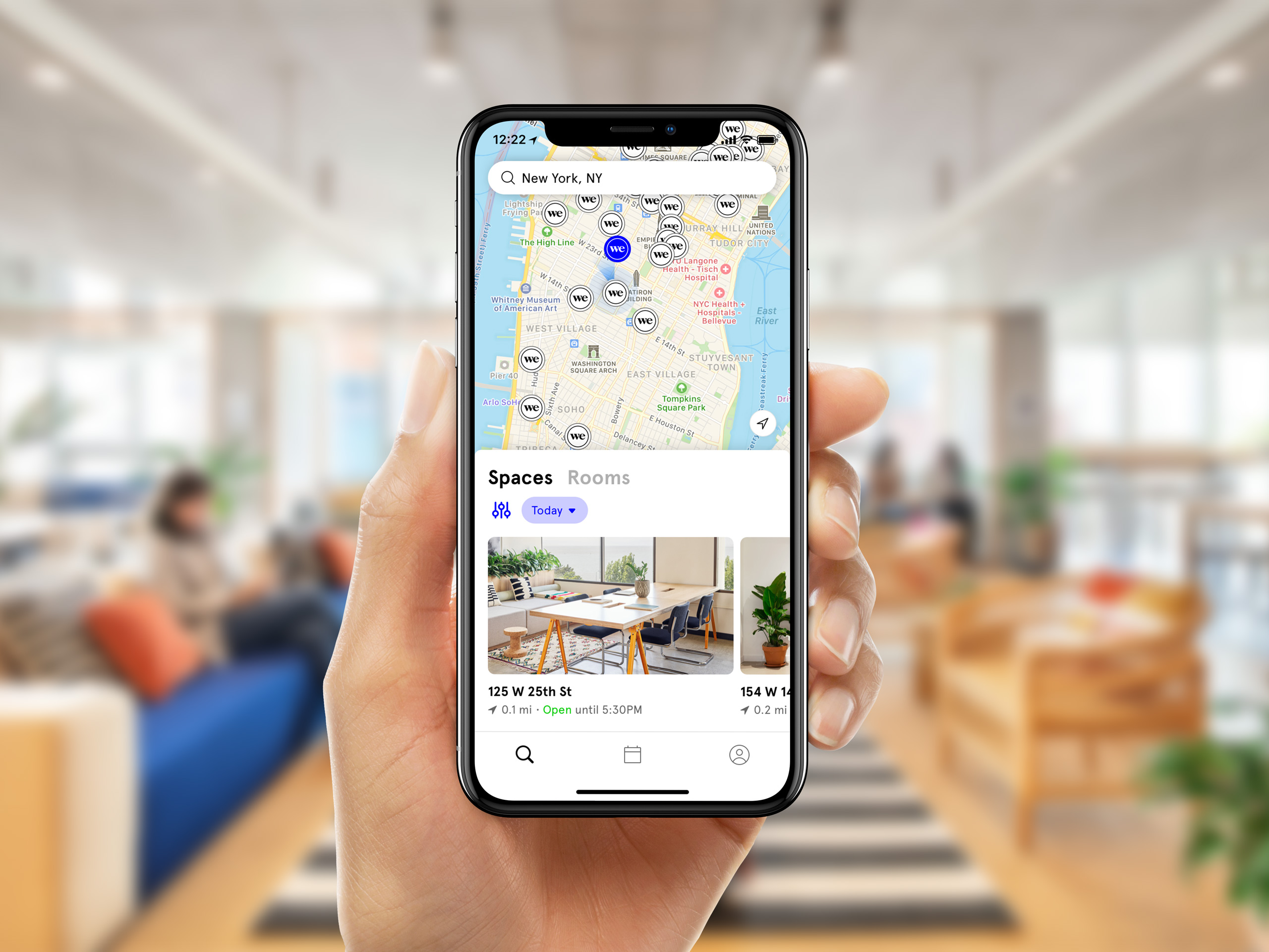
The new pay-as-you-go product from WeWork↗ started as a simple question: what might it look like to offer immediate access to our available workspaces by the day and conference rooms by the hour?
Since its successful launch on both iOS↗ and Android↗ during the pandemic, flexibility has become the new model for how WeWork thinks about its products both physically and digitally as they move towards true space-as-a-service offerings.
Since its successful launch on both iOS↗ and Android↗ during the pandemic, flexibility has become the new model for how WeWork thinks about its products both physically and digitally as they move towards true space-as-a-service offerings.
WeWork, On Demand
With a growing transient workforce desiring flexibility, our new app made it easy to find space across WeWork's global network.
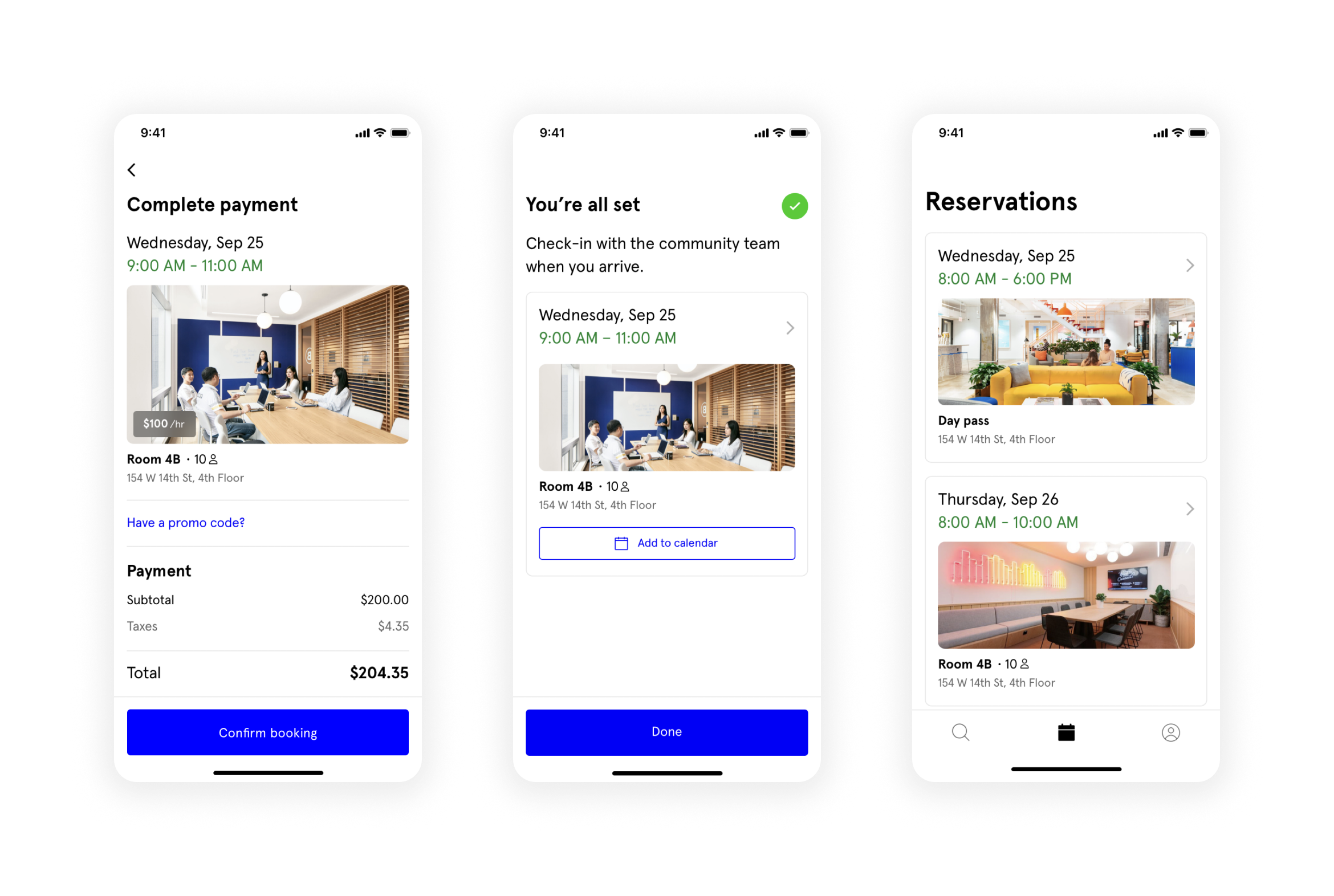
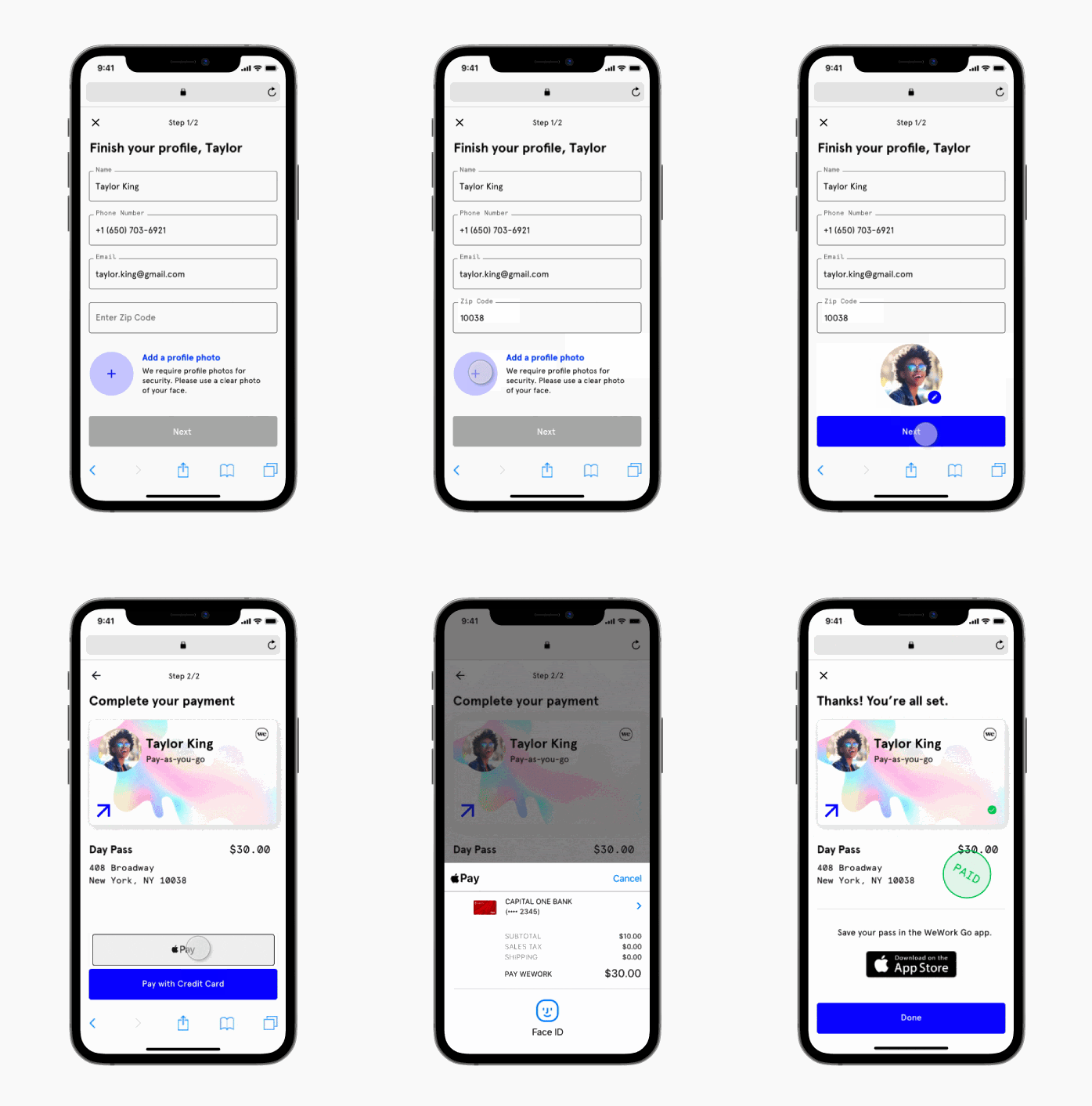
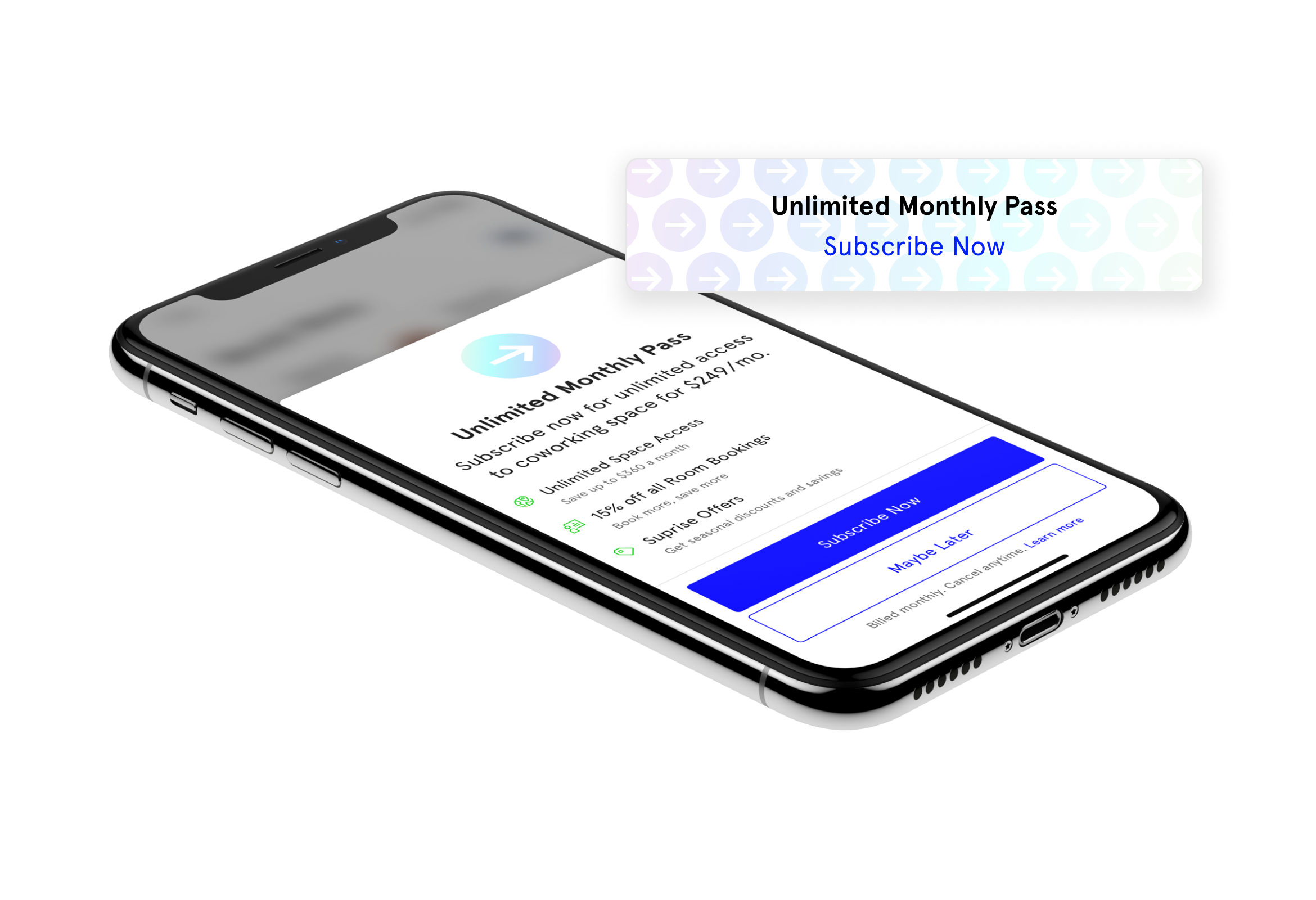
By allowing non-members to browse our workspace offerings without creating an account and book workspace in local currency instead of credits, On Demand increased member conversion, building profitability, and space utilization during the pandemic.

1st-Year Growth
NYC -> 30+ cities globally
10 -> 230+ WeWork locations
2 -> 3+ workspace offerings
—
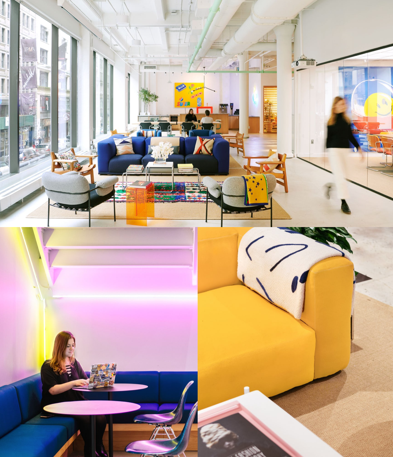
When I joined WeWork in 2018, I helped redesign and execute a global visual refresh of our Member app.
Inspired by new interior design directions in our spaces, the tech design team set out to give our app a look that would feel at home in our coworking spaces — and bring our app rating from 2 to 4+ ⭐️’s.

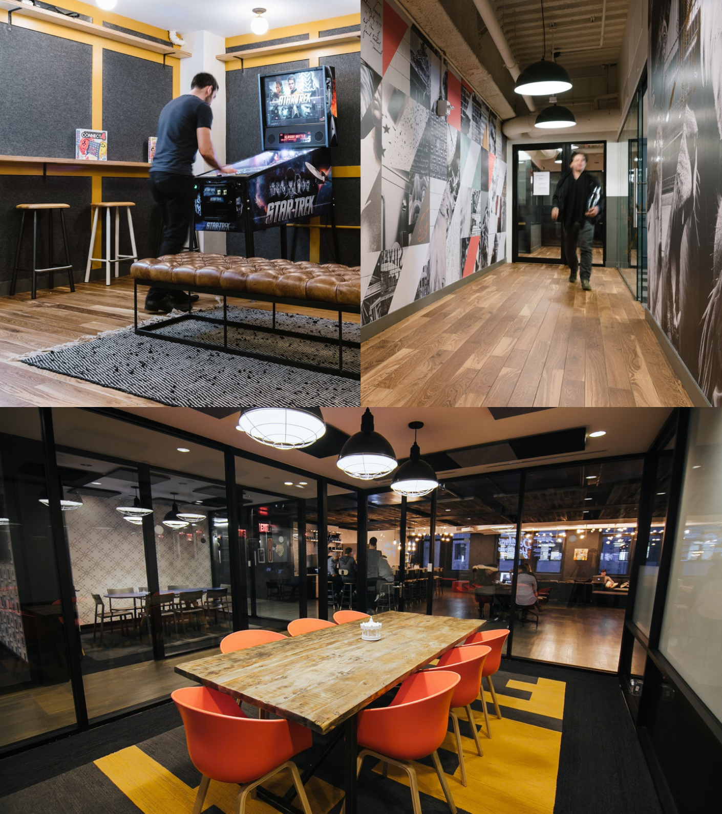
The Member app allowed our 500,000 members worldwide to interface with their buildings and eachother, and the product strategy at that time was around creating a physical social network.
Features included the ability to post to a Community feed, search for and message other members, attend events in your building and nearby, and book conference rooms. It was heavy on social engagement and light on utility, intended for a member-type that was limited to their single, specific building.

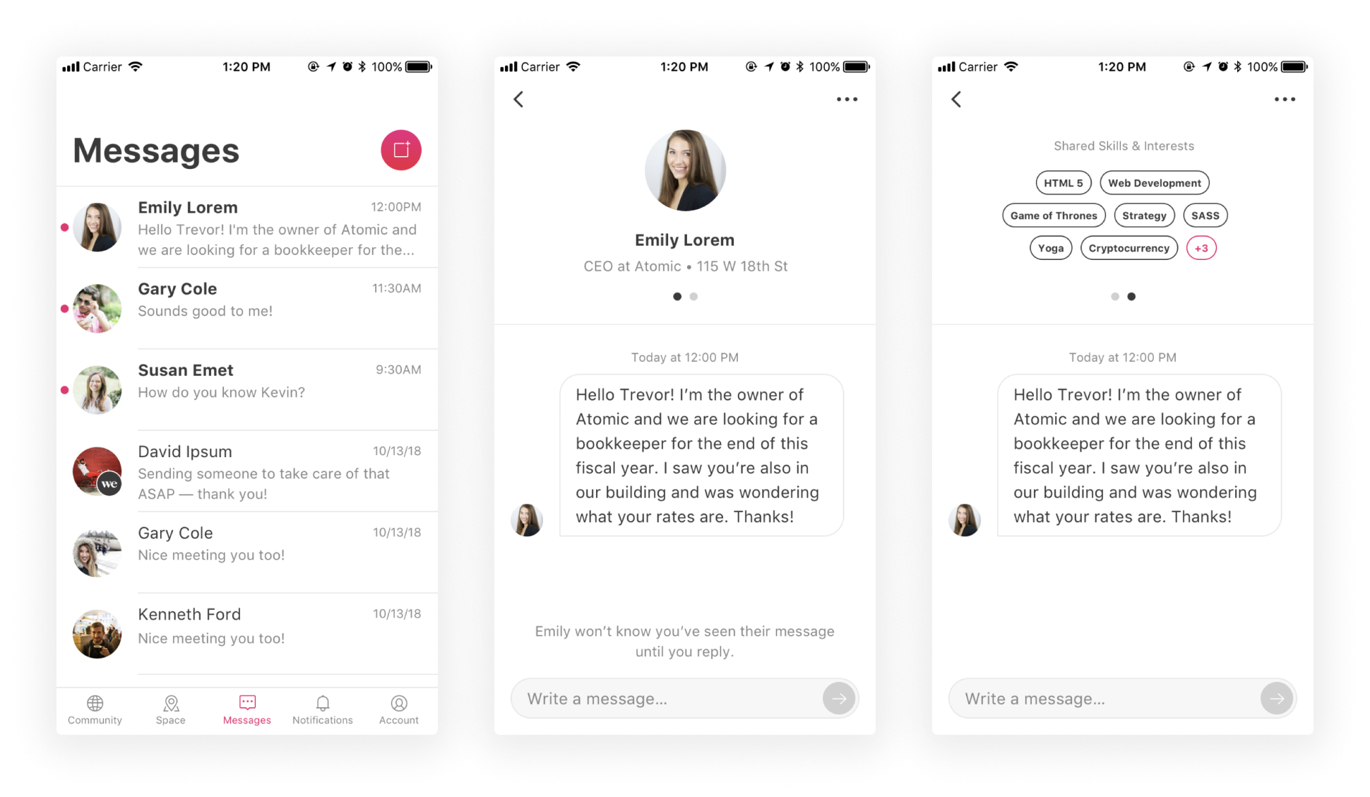
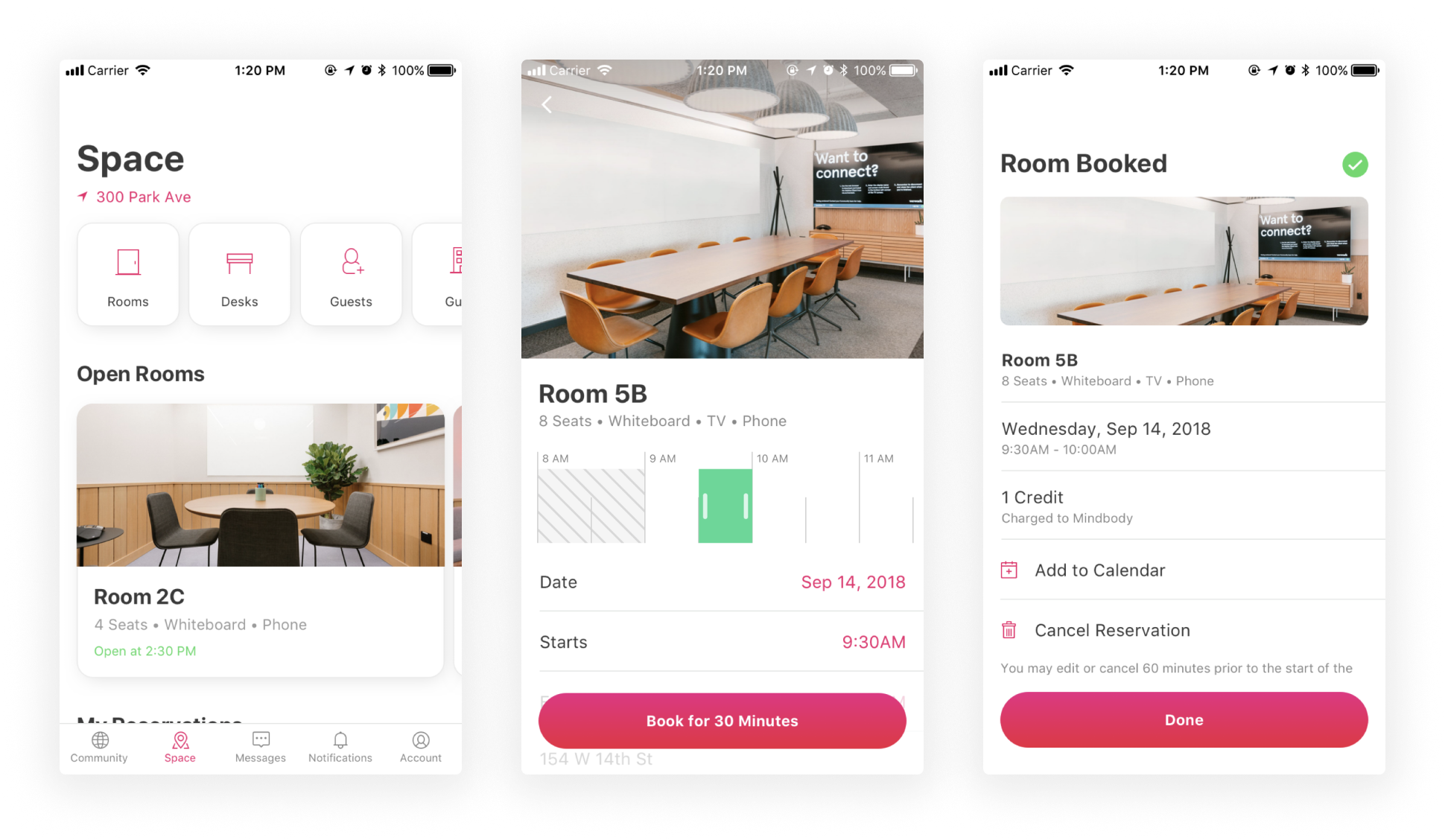
When considering how best to quickly prove whether pay-as-you-go was a viable offering, we concluded that trying to build it inside the current Member app was not going to serve us well for moving fast or attracting new members. The Member app suffered from a few core issues:
- Membership required. All functionality, even viewing spaces, was behind a member-only log-in.
- No account creation. Users had to go to our website to sign-up, which required committing to an expensive membership.
- Home location required. The app was architected around selecting a single “home” location that defined the entire experience.
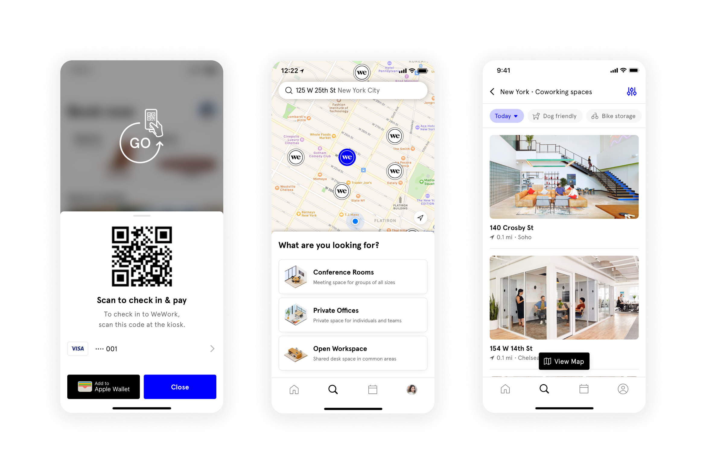
- No map-based browsing. It wasn't possible to search and filter for a specific workspace across an area.
- No currency support. Paying for space involved a confusing credit system.
- Social dis-engagement. The social features invited spam and abuse if open to the public.
In short, the current Member app became the “South Star” for our direction of this new, flexible product offering that did one thing well: booking space.
0 to 1
—
Frustrated with the Member app’s experience and strategy, myself and a product manager booked an off-site space for a week in true “On Demand” fashion to ideate a pay-as-you-go product. At the time, WeWork had a sprawling variety of 9+ low-commitment offerings with very high churn rates that were confusing for potential new members to navigate, difficult for sales to sell effectively, and created enormous tech-debt to maintain.
With On Demand we sought to simplify our offerings drastically by offering ONE product with by-the-day access to coworking space and by-the-hour access to conference rooms, no membership or monthly-fees required.

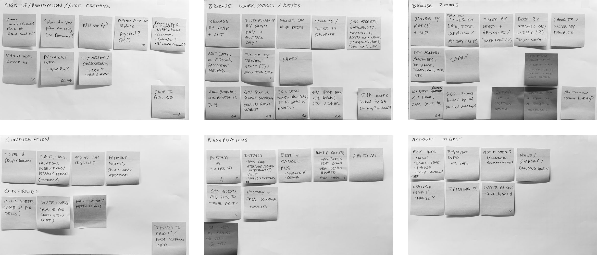
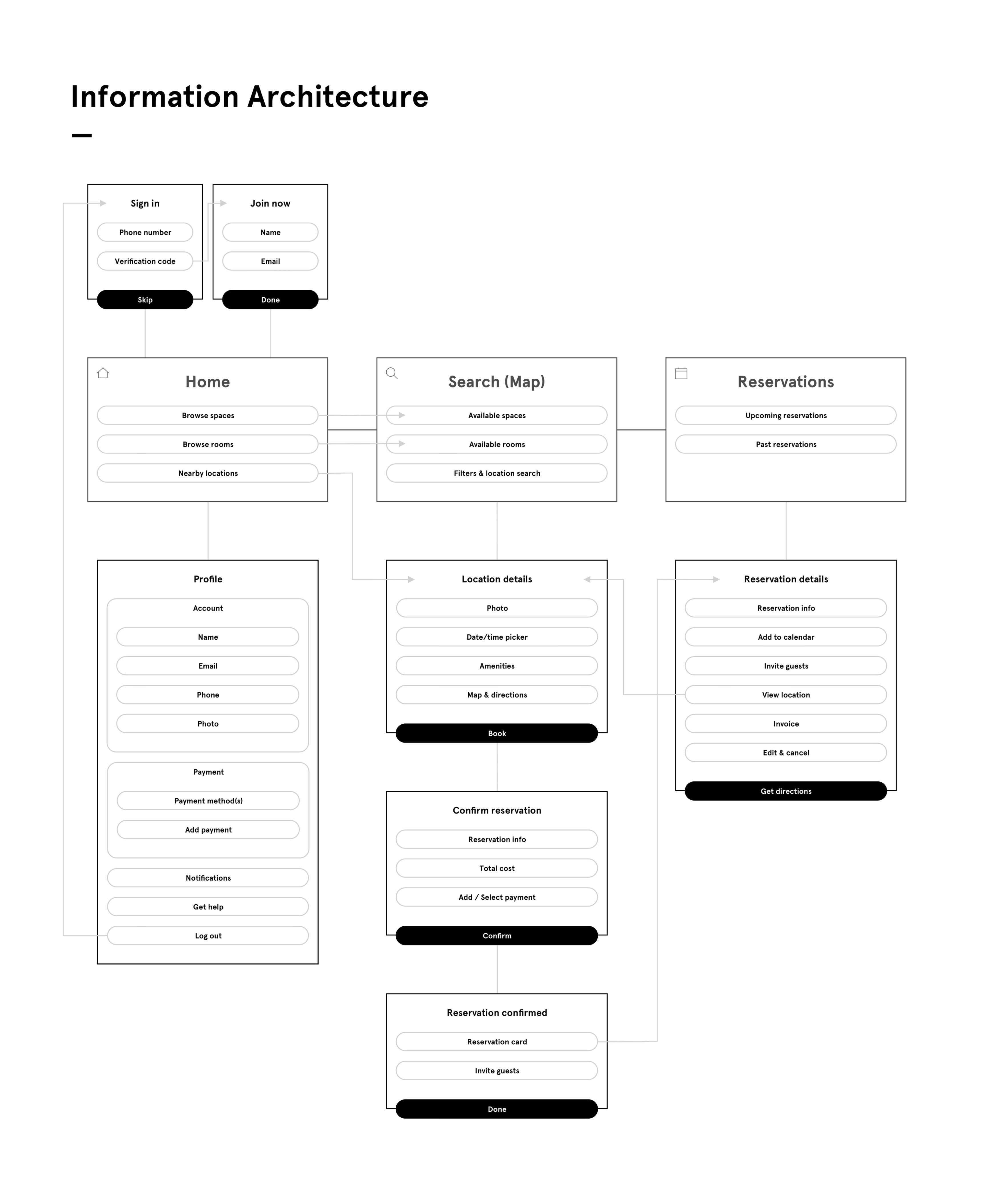


Sprint 0 ended with a high-level approach for a new pay-as-you-go product offering. We shopped this proposal around internally and got approval to build a small team to pursue the idea further.
✔ Competitive & comparative research
✔ MVP product requirements
✔ Design explorations & prototypes
✔ Information architecture & search schema
✔ User flows & prototypes
✔ MVP product requirements
✔ Design explorations & prototypes
✔ Information architecture & search schema
✔ User flows & prototypes
—
Drop by.
Check-in.
Get to work.
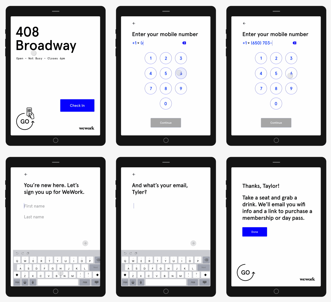
We knew from interviews that WeWorkers are here to get shit done — whether it’s trying out coworking, visiting while on business travel, getting some heads down time, meeting co-workers, impressing a client, or finding overflow and off-site space.

New users & use-cases
Casual co-workers
Freelancers
Remote workers
Business travelers
Overflow & off-site spaces
01.
Concentrating is their top priority.
People are here to get work done. In fact, their goal is to get to “getting their shit done” as quickly as possible.
02.
They want their needs to be met on-demand.
Preplanning isn’t their forte or their desire. They are seeking out on-demand workplace services for the flexibility to just show up.
03.
They want a seamless onboarding experience.
They want to get to concentrating as quickly as possible. Installing an app, carrying a key, inputting payment are all cumbersome barriers to that goal.
04.
They want to book space, not desks.
Members appreciate the flexibility of moving around the space as needed — from standing to sitting, soft seating to a desk chair.

Designing for the
Here & Now
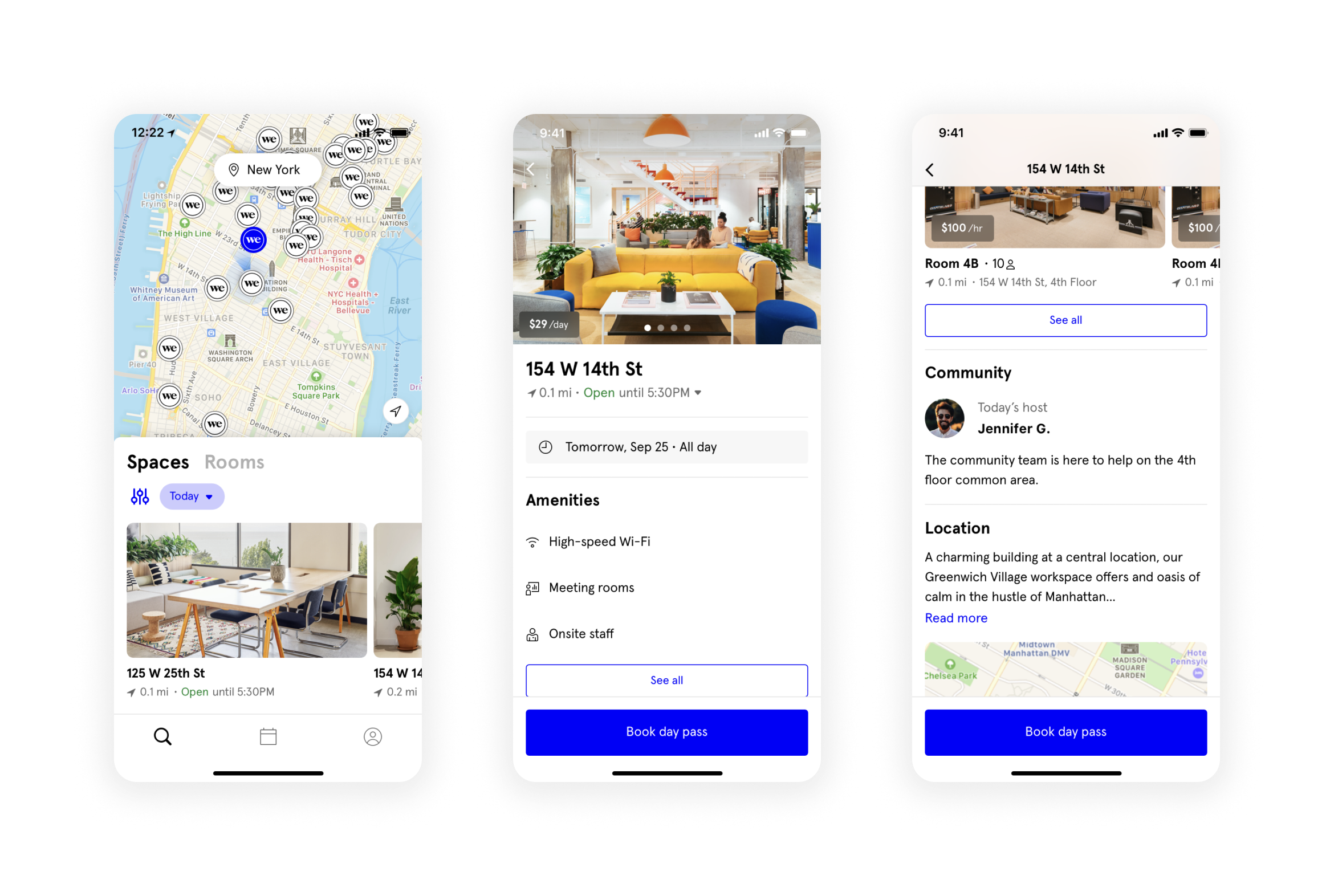
We knew from our data that WeWork members are distributed widely between those that book in the moment (<1hr ahead) and those that plan ahead (>12hrs ahead), so we couldn’t index too heavily for either scenario.
Our solution was to lead with a map view with the nearest location selected to solve for booking in the moment, but give prominent placement to filters with user-friendly options like “Today” and “Tomorrow” for date and “Morning” and “Afternoon” for time.
Our solution was to lead with a map view with the nearest location selected to solve for booking in the moment, but give prominent placement to filters with user-friendly options like “Today” and “Tomorrow” for date and “Morning” and “Afternoon” for time.

Visual Systems
Aligning our products across web, mobile, & physical space
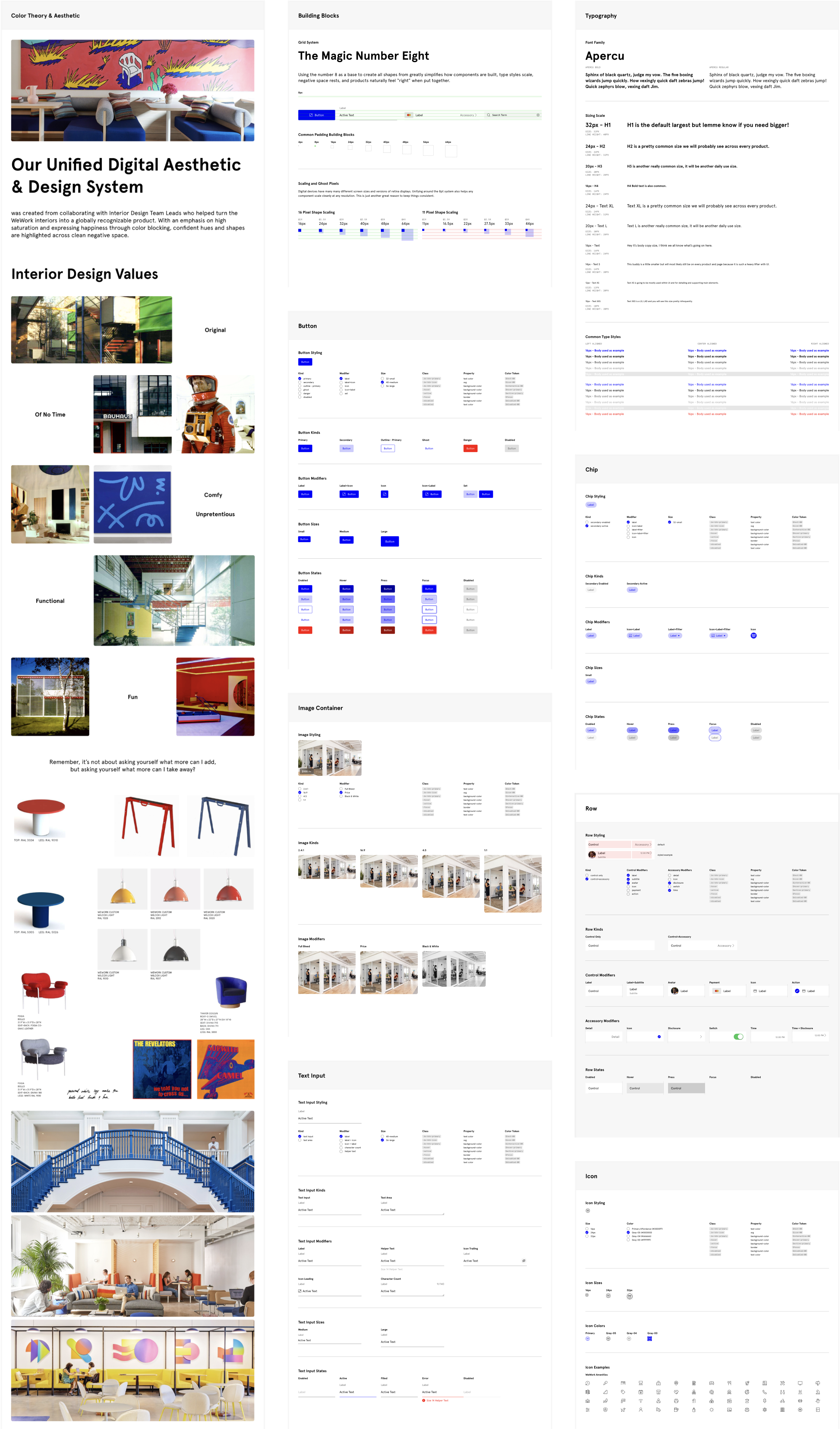
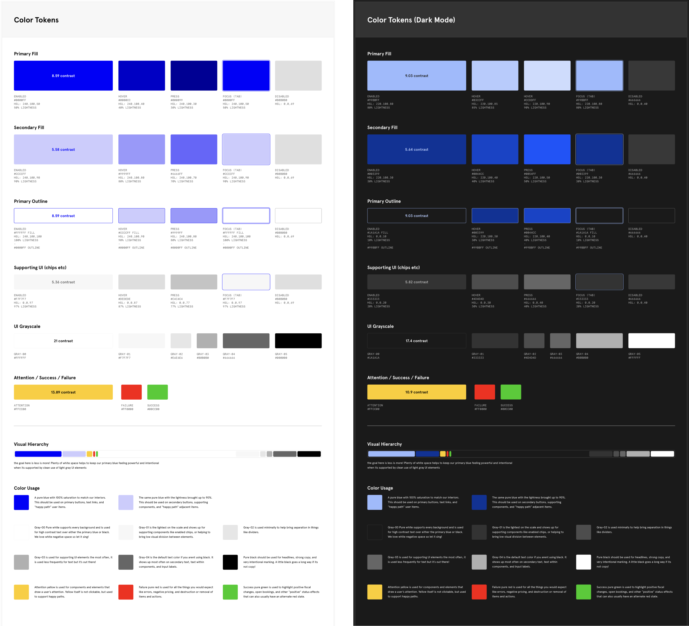
When we began production work for On Demand, we didn’t have a consistent design language system across our web and native products. We saw this new app as an opportunity to have product-led alignment of our visual systems. We collaborated with the WeWork.com team and interior design teams to define a consistent language across our digital and physical touchpoints.
—
A Vision for the
Future of Work
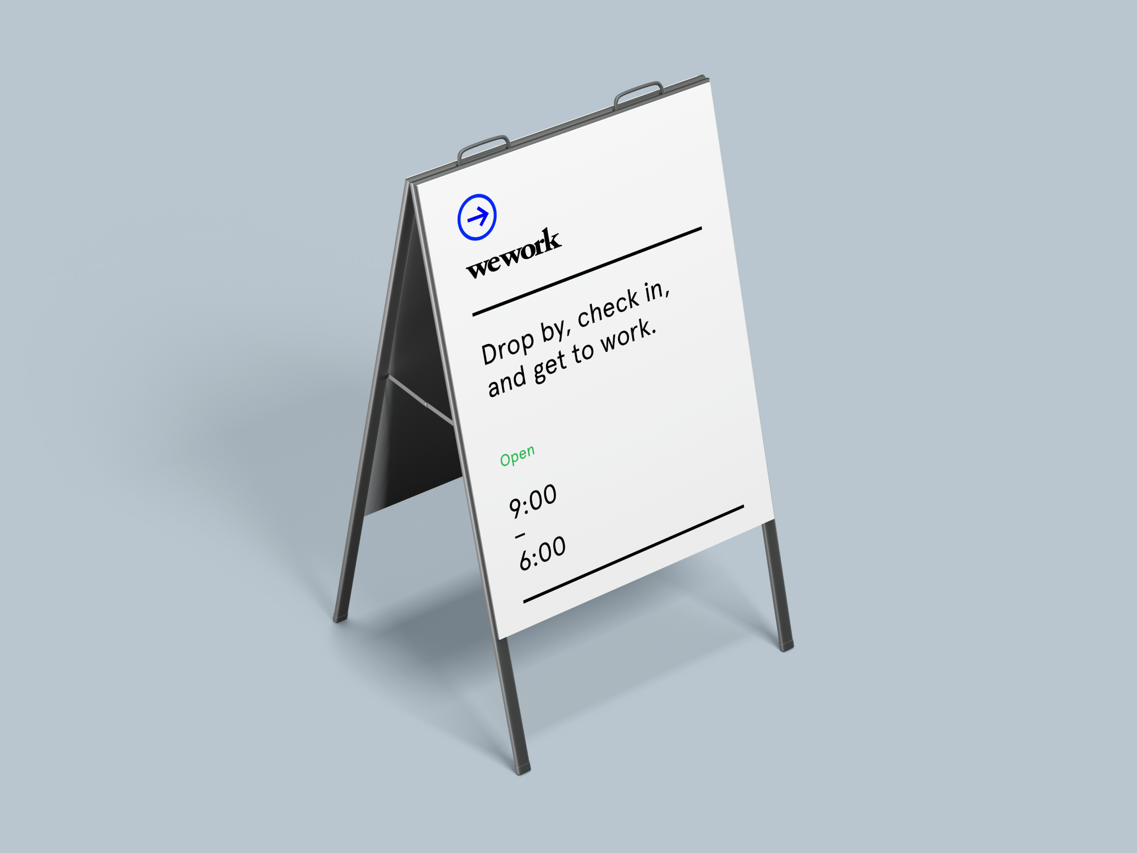
New branding was explored for On Demand to further differentiate it from our member app. Because these users are new to WeWork, and perhaps coworking in general, we wanted to utilize an arrow symbol as a wayfinding mechanism to provide a bread-crumb trail from sidewalk, to community floor, to workspace.


Growth
->
Profitability
At the time WeWork was pursuing an IPO in late 2019, the company strategy had pivoted from growth-at-all-costs to optimizing building profitability, and On Demand became a key initiative for providing new members access to underutilized workspace.
—
I left WeWork after scaling our On Demand MVP from local pilot to global launch. After leaving, the original Member app was sunset and all member-types were migrated to the new product.
Flexibility is the future of work.
Project credits
→ Design Lead: Piet Aukeman
→ Design Partner: Cody Butcher
→ Design Partner: Roo Guðbjartsson
→ Design Director: David Al-Ibrahim
→ Product Manager: Nick Mourgue
→ Product Manager: Meg Higgins
→ iOS Engineer: Michael Campbell
→ Android Engineer: Quentin Colle
→ Design Partner: Cody Butcher
→ Design Partner: Roo Guðbjartsson
→ Design Director: David Al-Ibrahim
→ Product Manager: Nick Mourgue
→ Product Manager: Meg Higgins
→ iOS Engineer: Michael Campbell
→ Android Engineer: Quentin Colle